A year-long effort to design a more expressive emoji system for Microsoft
In the Fall of 2020, when we set out to explore a new direction for Microsoft's emoji system, little did we know that it would soon come to life in our products and be experienced by customers all the globe. After taking some time to look back at what we accomplished together, I decided to put together this post as a summary of our adventure.

Our story began in October of 2020 during "Fix Hack Learn", a week-long quarterly event aimed at creating space for Microsoft employees to explore concepts they are passionate about. At that time, our project’s goal was focused on making our system of reactions more inclusive, enabling customers to choose their skin tone when reacting to a message or post on Teams and Yammer. But it was clear that we also had an opportunity to re-imagine our emojis under a completely new light. And ultimately, that’s what we did.
With potentially endless aesthetic directions, our instincts led us to borrow from the dimensional look and feel we had established through our UX storytelling efforts. In a few years, we had amassed a sizable collection of UX films and articles that pushed the limits in how our products were depicted, and which in turn created waves across our design language. It was time to take this direction one step further.
To bring this vision to life we partnered with our longtime collaborator Studio Tendril, and started the design process by leaning into customer feedback we had received about our existing emojis. As seen in the compilation below, the emojis in Windows 10 were simplistic, flat, and almost iconographic. This was in clear alignment with our old design language Metro, which had its roots in classic Swiss graphic design, but for that reason, was also at odds with the latest Fluent design direction and its principles.
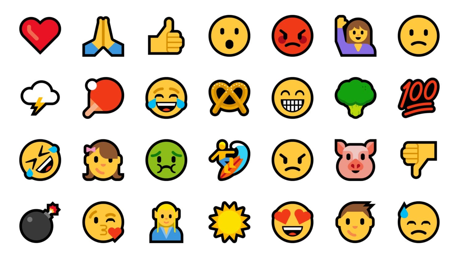
While bold outlines and a reductive color palette made the designs clear and accessible, it inadvertently prevented them from showing off the kinds of nuanced details that made them more expressive. The more we learned from customer feedback, the more we realized we were on the right path, where dimensionality would end up yielding a more human and approachable quality to the designs.
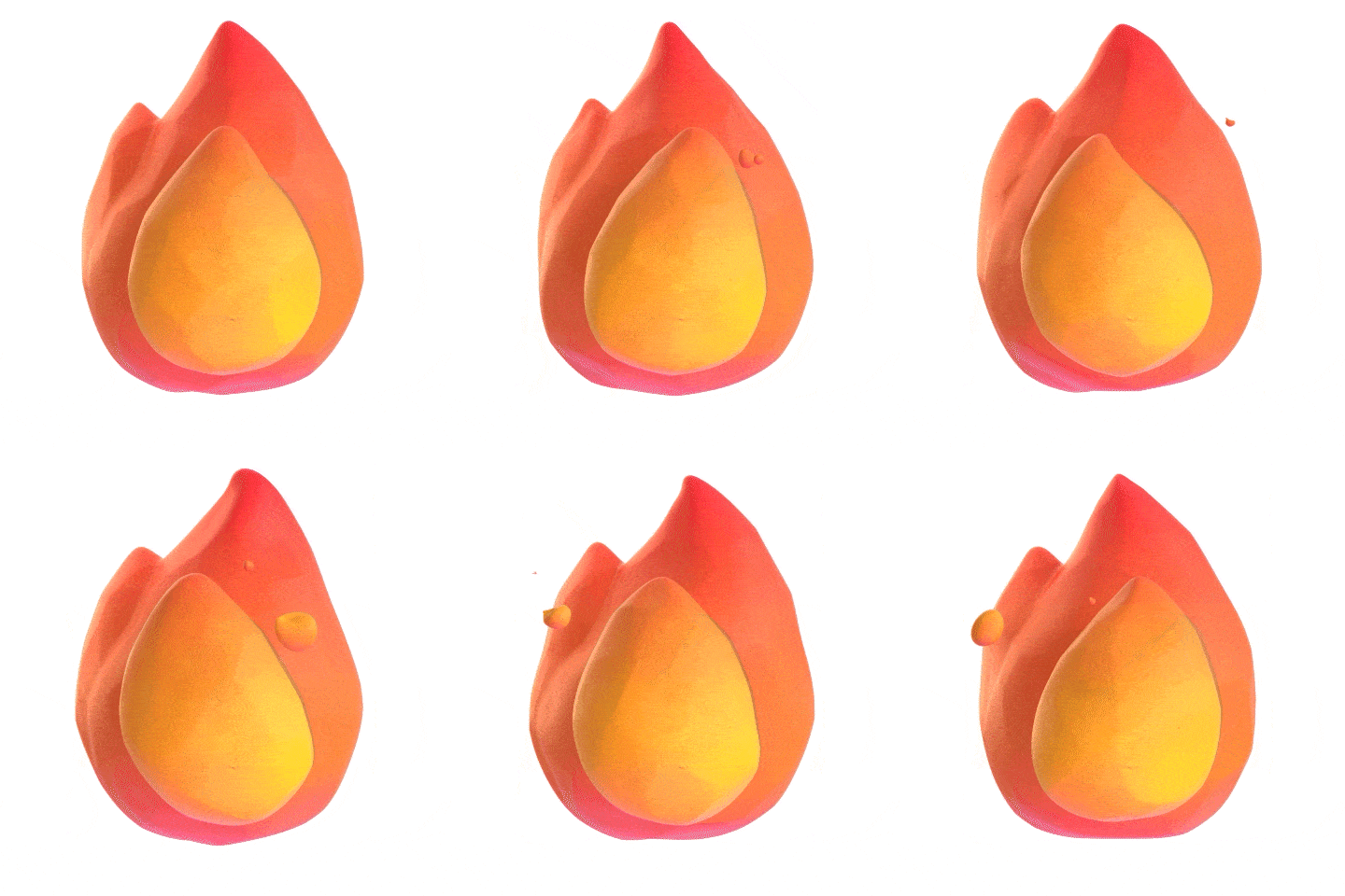
In retrospect, our very first explorations took us a little too far in visualizing materiality. The image below shows how in some of the early designs we borrowed from a rougher aesthetic inspired by wood carvings and clay sculptures. They were heartwarming and appeared to tap into a more universal, child-like aesthetic.
We even explored the use of fingerprint indentations to convey human influence in the making of each design, as well as a staccato quality to animations that was akin to stop motion, seen above in the Fire emoji. But in the end, given that our customers would be experiencing them in mostly small sizes, we felt this was not the approach forward as the most delightful details would be lost.
While the roughness of these designs wasn't appropriate, we fell in love with their boldness and vibrancy. After all, it was clear that reaching the right degree of expression would require putting as much focus on the color palette of our emojis as we did to the shapes themselves. We would move forward from here with determination to embrace these ideas across the entire set.
Read more:
The making of Fluent emoji
A year-long effort to design a more expressive emoji system for Microsoft In the Fall of 2020, when we set out to explore a new direction for Microsoft's emoji system, little did we know that it would soon come to life in our products and be experienced by customers all the globe. After taking some

