Hi, Microsoft 365 Insiders! We are Igor Zverev, a Software Engineer on the Word team, and Rob McKaughan, a typographer on the Advanced Reading Technology team. We are happy to announce several typography improvements in Word and Outlook for Windows to help you create more impactful content.
Typography improvements in Word and Outlook for Windows
Research shows that good design can make documents more credible, persuasive, and engaging. We are introducing a series of automatic typography features that enable you to reach these goals, without any effort on your part.
The first set of these research-backed refinements brings intelligent, adaptive justification, kerning, and OpenType ligatures to Read Mode in Word for Windows and the Reading Pane in Outlook for Windows.
These updates will be applied automatically, without major layout changes, only when our layout scoring algorithm determines that they will improve the layout.
And you are still in control: you can turn off these features at any time.
How it works
In Word:
- Open an existing document and click View > Read Mode.
- Adjust the text to a comfortable size by moving the Zoom slider in the lower right corner of the screen.
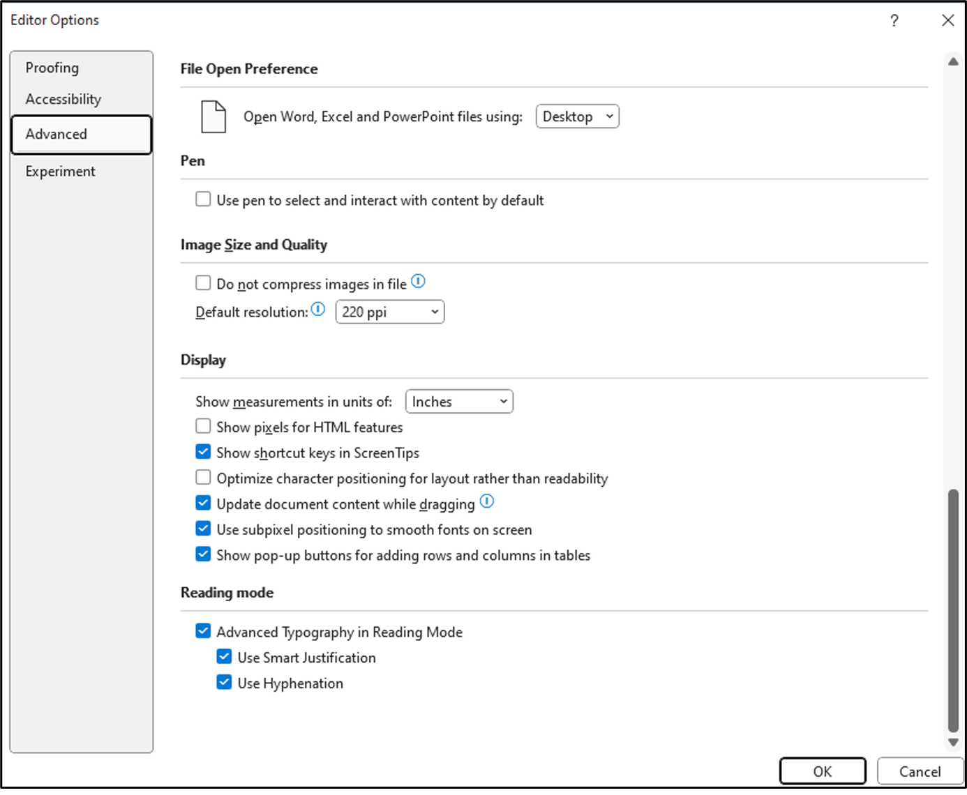
- To turn off these features, click File > Options > Advanced > Reading Mode, and then clear the Advanced Typography in Reading Mode checkbox.
- To turn off only Use Smart Justification or Use Hyphenation individually, clear the corresponding check box.
In Outlook:
- The new typography features are enabled by default in the Reading Pane. To show the Reading Pane, click View > Reading Pane > Right or Bottom.
- To turn off these features, click File > Options > Mail > Editor Options > Advanced > Reading mode, and then clear the Advanced Typography in Reading Mode checkbox.
- To turn off only Use Smart Justification or Use Hyphenation individually, clear the corresponding check box.
What is the impact of those settings on your content?
- Full justification with adaptive, optimal paragraph algorithm. Full justification is one of the hallmarks of fine typography, and is present in most professional books, magazines, and editorial design. Aligning the text on both the right and left creates a clear box of the text, which in turn reinforces the graphic organization and underlying structure of the page. Good justification is difficult to get right: badly justified text can lead to rivers of whitespace that can be distracting. To eliminate these issues, we are using a highly tuned “optimal paragraph” algorithm which evaluates many ways of laying out each line in a paragraph, and chooses the layout with the most even arrangement of whitespace over the whole paragraph. Our justification algorithm uses not only spaces between words but also inter-letter spacing. Our algorithm doesn’t force justification, either – if it determines that the text would look better without justification, it’ll automatically leave it off.
- OpenType kerning. If all letters were simply rectangles, typography would be easy. Letters (hypothetical rectangles) would line up next to each other and have exactly the same visual space between them. But letters are irregular. The capital T has a bunch of white space under it and if you just arranged letters based on their edges, then the word “Typography” would look more like “T ypography”. Kerning adjusts the spacing between specific pairs to make them fit better visually. Another good example, consider the word “MUSTARD.” The capital letter A has the opposite problem to the capital letter T – it has a lot of space above it. Put them together with kerning, and the A tucks nicely under the T. Without kerning, it looks more like “MUST ARD”, which might slow readers thinking that it’s two words. Matthew Butterick’s Practical Typography site has many more examples.
- OpenType ligatures. The irregular shapes of letters can sometimes clash with each other. For example, the hook on the lowercase f can smash into the dot on the i or j. The tail of a y can crash into a preceding g in “edgy.” Ligatures are a way of substituting two or more characters with a single combined letter that is specifically drawn for that case. The Practical Typography site has many examples.
Availability
The new typography features are currently available Beta Channel users running Version 2312 (Build 17116.20000) or later.
Feedback
We are excited to hear from you and hearing what you think! We would love to get more feedback to help us continue to tune our layout algorithms. If you see any problematic or unsightly layouts, please share them with us by selecting Help > Feedback in Word or Outlook for Windows, and if possible, include a screenshot to show the layout issues you have encountered.
Source:

Typography improvements in Word and Outlook for Windows
Check out this series of automatic typography features that enable you to make documents more credible, persuasive, and engaging.