Microsoft 365 Insider Blog:
Hello, Insiders! I’m Shireen Salma, a Product Manager on the Office Accessibility team. I’m excited to announce that we are upgrading the standard red font color in the color picker in Microsoft Word, PowerPoint, Outlook, and OneNote on Windows and Mac to make it more inclusive and accessible to all users.
Improving accessibility: Standard red gets an update in Microsoft 365
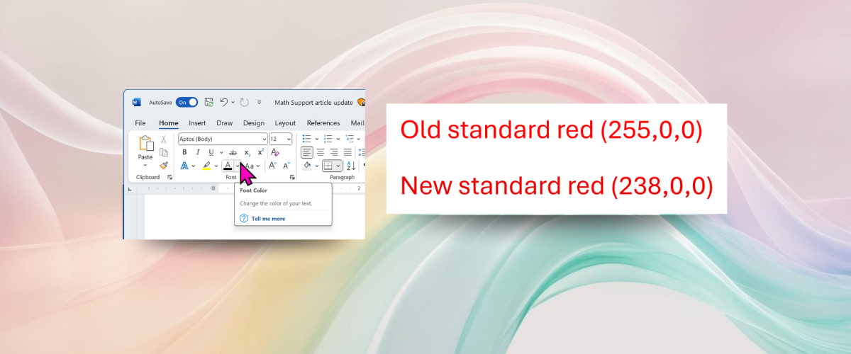
The standard red font color (RGB 255,0,0) is one of the most commonly used in Microsoft 365, whether to highlight important text in Word or add emphasis to a slide in PowerPoint. However, our previous standard red did not meet the Web Content Accessibility Guidelines (WCAG) standard color contrast requirement against a white background for body text. By slightly darkening the red (RGB 238,0,0), we increase the contrast ratio enough to meet WCAG standards.While the difference may look subtle, it significantly improves color contrast, making red text easier to read for more people, especially those with low vision or color vision deficiencies.

How it works
- Open Word, PowerPoint, Outlook, or OneNote on your Windows or Mac device.
- Select a word or block of text to change the font color of.
- Select Home > Font Color.
- Select the red color under Standard Colors.


Availability
This change is available for Word, PowerPoint, Outlook, or OneNote users running:- Windows: Version 2411 (Build 18324.20012) or later.
- Mac: Version 16.92 (Build 24120731) or later.
Feedback
We’d love to hear your thoughts on how this update is working! In your preferred app, select Help on the ribbon, and then select Feedback to provide feedback. Source:
Improving accessibility: Standard red gets an update in Microsoft 365
We upgraded the standard red font color in Microsoft Word, PowerPoint, Outlook, and OneNote on Windows and Mac to make it more inclusive and accessible to...
 techcommunity.microsoft.com