- Local time
- 8:02 AM
- Posts
- 7,446
- OS
- Windows 11 Pro + Win11 Canary VM.
MS's track record on Start menus is woeful.
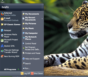
We has original menus in early versions that basically were not much more than a series of icons on a screen and most you could do was move them around a bit (jeepers - just realised we have gone full circle with W11 menu -LOL).
Then things evolved, eventually ending up with W7 menu which may still prefer.
They dropped the ball on W8 by not even having a proper one, thinking the full screen start menu was way to go.
They introduced W10 menu, and at first it was a bit unpolished but over time it improved e.g. nested folders, better visual themes etc. To me, the W10 Start Menu is pretty good now and flexible. You can resize it etc.
Then, to my horror, they have thrown it all away fro the pitiful garbage of icons on a screen with no grouping or nesting ability. I do not care much about cosmetic changes but I do care about functional changes.
Another major gripe of mine is the intrusive space wasting section at bottom for recommended apps. You turn them off in settings but it leaves the recommended text saying you can turn it on. I know that as I bloody turned them off in first case.
Who needs a search bar on menu. I have one on taskbar.
Worse still, the menu cannot be resized or moved. This is the lowest common denominator of a menu that is bloody possible.
The ruddy menu now is essentially back to W3.1 but worse due to wasted space!
One could always argue whether W7 or W10 menu is better but that is personal preference as both are functional and customisable.
On thing is for sure MS have no idea about a new menu for W11 of they think this pitiful garbage is an improvement.
My Computer
System One
-
- OS
- Windows 11 Pro + Win11 Canary VM.
- Computer type
- Laptop
- Manufacturer/Model
- ASUS Zenbook 14
- CPU
- I9 13th gen i9-13900H 2.60 GHZ
- Motherboard
- Yep, Laptop has one.
- Memory
- 16 GB soldered
- Graphics Card(s)
- Integrated Intel Iris XE
- Sound Card
- Realtek built in
- Monitor(s) Displays
- laptop OLED screen
- Screen Resolution
- 2880x1800 touchscreen
- Hard Drives
- 1 TB NVME SSD (only weakness is only one slot)
- PSU
- Internal + 65W thunderbolt USB4 charger
- Case
- Yep, got one
- Cooling
- Stella Artois (UK pint cans - 568 ml) - extra cost.
- Keyboard
- Built in UK keybd
- Mouse
- Bluetooth , wireless dongled, wired
- Internet Speed
- 900 mbs (ethernet), wifi 6 typical 350-450 mb/s both up and down
- Browser
- Edge
- Antivirus
- Defender
- Other Info
- TPM 2.0, 2xUSB4 thunderbolt, 1xUsb3 (usb a), 1xUsb-c, hdmi out, 3.5 mm audio out/in combo, ASUS backlit trackpad (inc. switchable number pad)
Macrium Reflect Home V8
Office 365 Family (6 users each 1TB onedrive space)
Hyper-V (a vm runs almost as fast as my older laptop)


