Microsoft Store apps - Remove blue background on Icons


aaron106

Member
Local time
7:44 AM
Posts
39
OS
Windows 11
1678161702886-png.54472

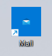
How can I remove the blue background on Microsoft Store apps permanently, I can right click and go into properties then get to the WindowsApps folder and change the Icon to its normal size, but this is annoying as everytime the app updates I get a white blank icon then have to repeat this over again. Any solutions
 

Attachments

  • 1678161702886.png
    1678161702886.png
    1.4 KB · Views: 18

My Computer

System One

  • OS
    Windows 11
Windows 11 UI works based on XML files. You have to change the app's XML manifest file (AppxManifest.xml).

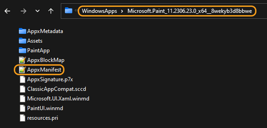
Store apps manifest is located in the apps directory:
1- C:\Windows\SystemApps
2- C:\Program Files\WindowsApps

s1.png


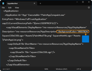
Go to the desired app folder and change the "Background" value in the "AppManifets.xml" file to "Transparent" (make a backup of the file before any modification).

s2.png

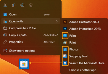
I want to change this rubbish blue from this menu ("Open with"), but I can't!

s3.png
 

My Computer

System One

  • OS
    Win 11 Enterprise
    Computer type
    Laptop
    CPU
    i7
    Hard Drives
    SSD
@atinfo Everytime the app updates from MS store; will the modification I made to the XML manifest file be reset?
 
Last edited:

My Computer

System One

  • OS
    Windows 11
I want to change this rubbish blue from this menu ("Open with"), but I can't!
You gotta get rid of that rubbish menu!!! ;-)

0005093.png
 

My Computers

System One System Two

  • OS
    Windows 11
    Computer type
    PC/Desktop
    Manufacturer/Model
    ASUS ROG Strix
  • Operating System
    Windows 11
    Computer type
    Laptop
    Manufacturer/Model
    ASUS VivoBook
@atinfo Everytime the app updates from MS store; will the modification I made to the XML manifest file be reset?
I did not check it.

You gotta get rid of that rubbish menu!!! ;-)
No offence to your font choice. Why it's under pressure from both sides? It feels like two characters are pressing the middle one from behind/back and front. The font has to be a bit chubby to be legible. Also, your menu has a matt background.

I like Win 11 new menu except for its font, size (takes more space than it needs), highlight (when you select an option from the menu,
the highlight colour is a slight tint of acrylic grey, which is barely noticeable), and non-customizable feature.

As I realized, the only thing I like about it is the blurry UI (Acrylic) and the rounded corners (which made it smooth).
 

My Computer

System One

  • OS
    Win 11 Enterprise
    Computer type
    Laptop
    CPU
    i7
    Hard Drives
    SSD
... your font choice...
It's a small pt, semi-condensed font.
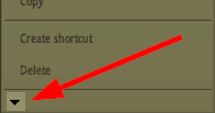
I have some long menus and I despise that fact that they are un-scrollable, having to click on that tiny arrow to cascade...

0005087.png

... the smaller font circumvents that problem.
... your menu has a matt background...
I don't do the Acrylic thing.
 

My Computers

System One System Two

  • OS
    Windows 11
    Computer type
    PC/Desktop
    Manufacturer/Model
    ASUS ROG Strix
  • Operating System
    Windows 11
    Computer type
    Laptop
    Manufacturer/Model
    ASUS VivoBook
... having to click on that tiny arrow to cascade...
I have some of those micro-arrows (in the Photoshop font, filters,... menu) and I hate that! :woozy:

s1.png

It's a small pt, semi-condensed font.
I have some long menus and I despise that fact that they are un-scrollable, having to click on that tiny arrow to cascade...
... the smaller font circumvents that problem.
I am not a font specialist, but AFAIK, (font) tracking has a big role in taking the space! All the fonts below are the same (Helvetica Now Var) with the same size (50 pt) and tracking (0). You can consider the orange box as a menu!

s2.png

Personally, I don't like condensed fonts, even when they are bold, because that makes it hard to be legible (of course for me). Glyphs (fonts) like "Helvetica Text" are great for my eyes to follow them in a sentence. These types of fonts are well-crafted for non-English readers!
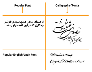
Glyphs in a word are not separated in my native language, and separated glyphs (characters) are hard to read for me.

My native language fonts and English fonts (regular font vs. calligraphy which I love, because the words have very smooth curves, and I enjoy watching them):

s3.png
 

My Computer

System One

  • OS
    Win 11 Enterprise
    Computer type
    Laptop
    CPU
    i7
    Hard Drives
    SSD

Latest Support Threads

Back
Top Bottom