Thanks - it was 4945372 missing - I had all the others - in fact more than above.
I used vivetool /enable /id:48433719,49221331,47205210,49381526,49402389,49820095,55495322,4945372
and it now works.
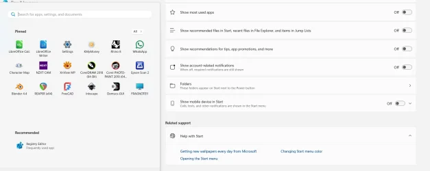
The pox ridden recommended section is now gone!
I cannot really see point of "show less" on the icons to only show two rows. This is reminiscent of the pre-android 15 android notifications section where one swipe just showed two rows, and an extra swipe is needed to show all (this can be changed in Android 15)
Still not sure I really like all apps section following the pinned icons. I would have like option to leave that as at present i.e. on a second page.
I do like the grid view puting icons for a letter horizontally (spilling over to another row as needed). This certainly reduces amount of scrolling to find a particular app where it is to easy to scroll past an icon.
I really dislike the category view - trying to look like an iphone.
In the end, MS just cannot get rid of the ridiculous "make it look like a mobile phone so kiddiwinks can use it" mentality. The Windows 8 fiasco should have told them that was a BAD decision. I am reminded of the old Billy Connolly sketch about weather forecasters putting fluffy clouds on a screen and he shouts "tell us it is going to rain - we can take it!".
TBH, I was ok with the old style W11 menu with the exception of the recommended section. Who the hell ever decided this was a good idea - recommended by who?
I do note however, you are not limited to 4 rows in pinned apps, or at least I have not put enough on to find if a limit.
I still do not like that you cannot directly resize the menu so it is less intrusive when it pops up - if anything it is worse now.
Overall, it is a bit better but is still obviously designed by 13 year olds with no real appreciation of ergonomics/aesthetics.
Deities Fangs when Asinine Idiots start to redesign the menus - we will comply or be assassinated!
View attachment 140598
View attachment 140599


")