That's extremely frustrating. Why are the developers expending effort to make their product harder to use?
Lest you think I'm making a fuss about something trivial, I'll explain the use case. I'm converting many dozens of accumulated recipes from PDFs and DOCX files to a recipe manager program. The program has "smart" features that reduce the amount of retyping I must do, but using them involves a lot of switching between the two programs: switch to the PDF, copy the recipe description, switch to the recipe manager, paste and edit, switch back to the PDF, copy the ingredients, switch back to the recipe manager, paste and edit, and so on.
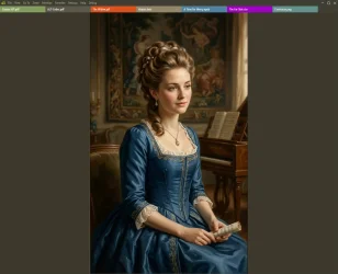
Since editing is inherently keyboard-centric, this conversion operation is keyboard centric. I switch between applications by using the Windows shortcut Ctrl+Tab, but there's a relatively high "cost" to entering keystrokes for one application when the other one is active, so the switch should always be followed by check that Windows did what I intended; that I didn't hit the wrong key, fail to press hard enough, etc. I check by glancing at the title bar of the application I'm switching to; but in the new improved SumatraPDF, it gives me no indication whatever of whether it's active or not.
As it happens, the recipe manager I'm using does the same, so the problem of no visual confirmation expands to both of them in both time and space.
The solution to this is to look for confirmation at the task bar instead of the application's title bar. But the next thing I want to do after switching requires focusing my attention on the (hopefully) active window's content, and the title bar is a large area nearby, so I can look at the content and confirm that the window is active with my peripheral vision. The buttons on the task bar, in contrast, are small and relatively far away; to check them I must actually move my eyes from the inactive window to the task bar, then to the active window, or worse, instinctively from the inactive window to the active window, then to the taskbar, then back.
Additionally, my habit of checking the title bar has been engraved on my reptilian brain by about 30 years of using Windows, and is not readily subject to change.
Now you're thinking, "this is trivial; the extra operations he's talking about take only a fraction of a second." That's true, but it's something I do a half dozen times for each recipe, and there are many recipes; those fractions of a second add up.
All of this would be avoided if at least one of these applications changed the appearance of the title bar when active. This is not asking the developers to figure out the whole series of usability considerations that I've explained above; it's only asking them to follow a UI custom (formerly a Microsoft UI standard) that has existed at least since early versions of Microsoft Windows were released!